One landing page to motivate 10M+ collectors to redeem
Market and user research revealed that one of the main barriers to redemption was low value perception. Collectors weren't sure what their Miles were worth or what they could get based on their current balance, even though 80% of collectors had enough Miles to redeem for a reward. There was also low awareness of the breadth of rewards available to collectors.
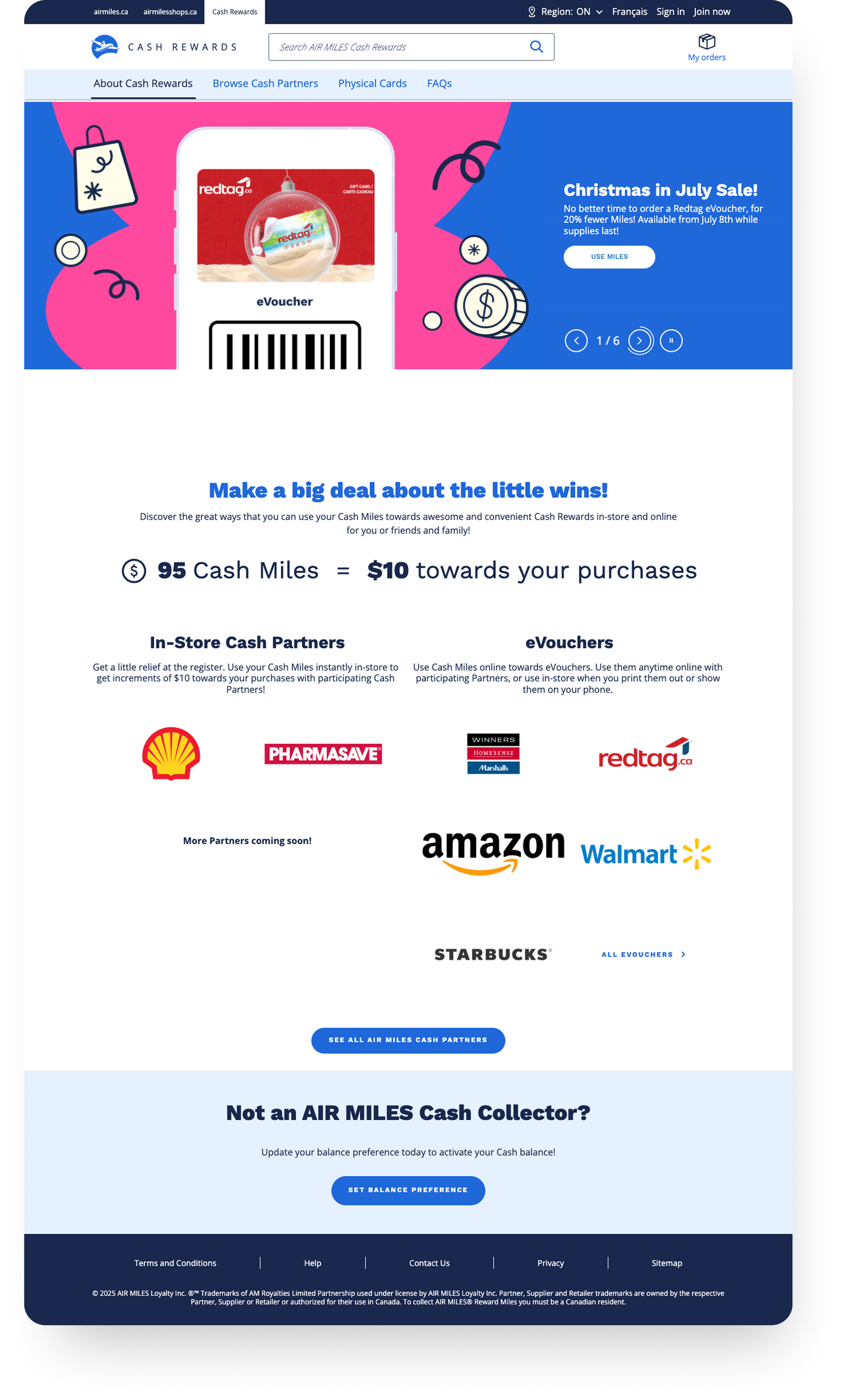
Additionally, due to back end technical constraints, the Rewards catalog was separated across 3 different sites, making it impossible to view different types of Rewards within the same page, and making for a very confusing and disjointed browsing experience for collectors.
Consolidating 3 landing pages and navigations into one required rethinking the IA within the constraints of an existing header structure. The navigation needed to balance user goals with business priorities around surfacing key entry points. We partnered with UXR to conduct a card sort exercise to understand how collectors naturally grouped different items. Based on UX research, competitor analysis, and Baymard practices, we designed an intuitive navigation experience for our collectors.
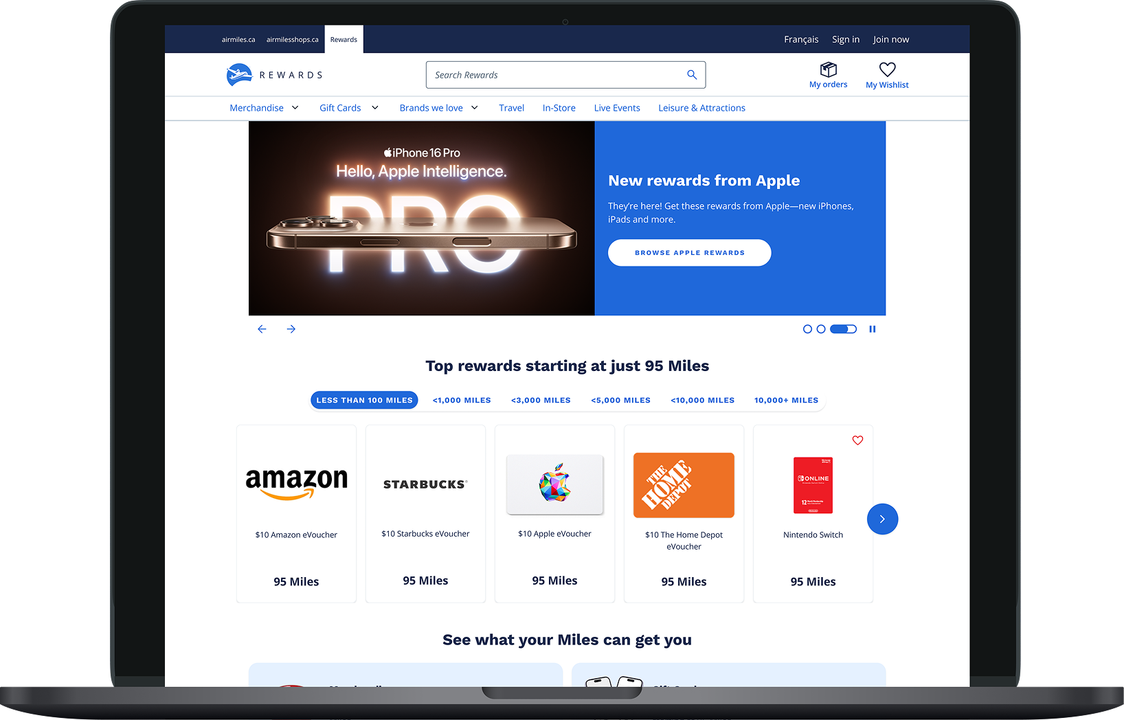
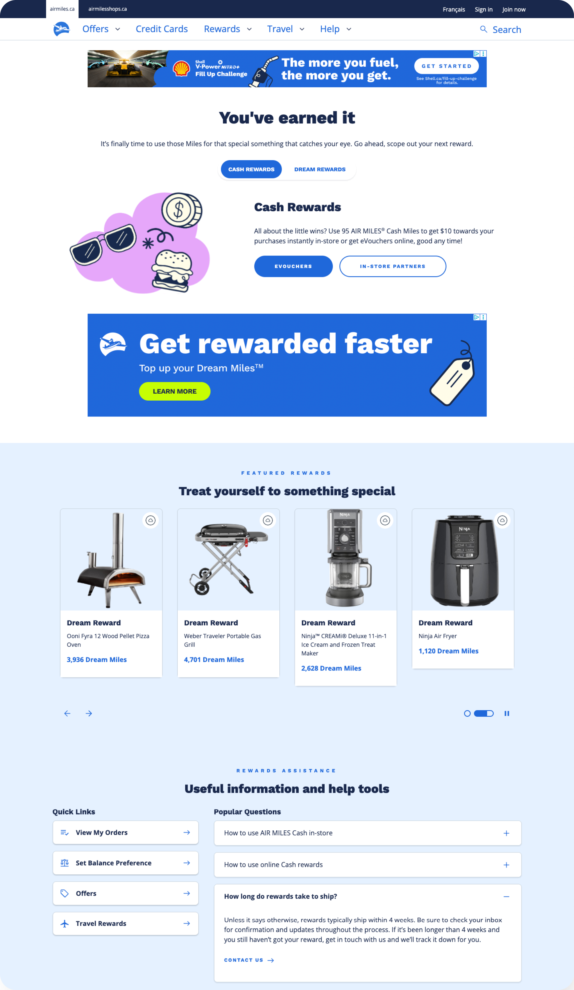
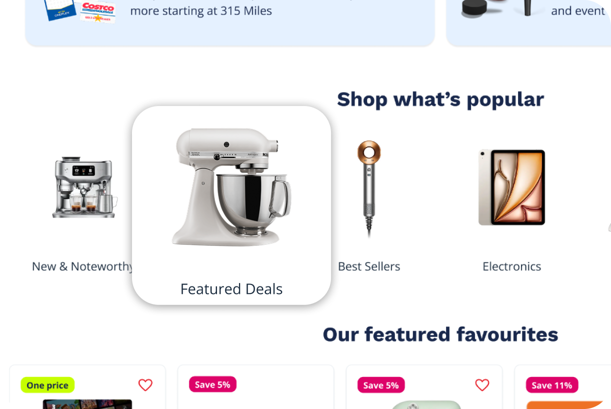
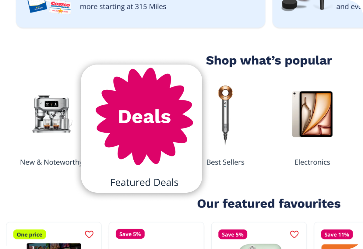
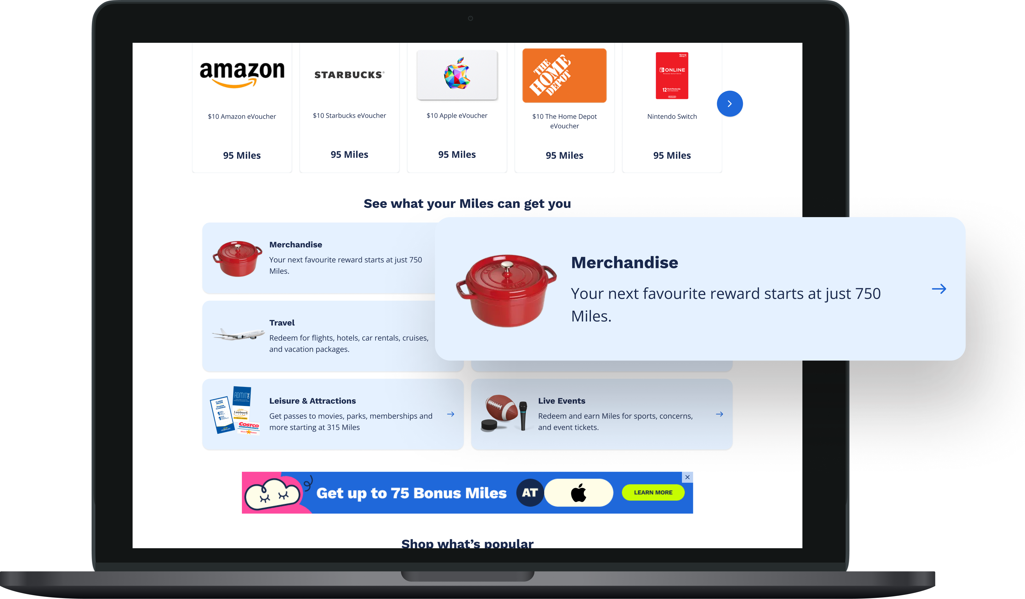
I designed a consolidated rewards landing page that focused on showcasing the breadth of the rewards catalog, motivating and incentiizing collectors to browse and explore by leaning into showcasing products and product imagery. Additionally, I wanted to bring transparency to collectors around how much their Miles were worth.
While formal usability testing wasn’t conducted on the web landing page, we ran usability testing on the redesigned app landing screen which shared the same elements, structure, and content. Those insights directly informed design decisions on web.
This was a net-new section that used tabs to showcase products by Miles range to set expectations around how much Miles were worth. Testing validated the tabbed approach as an intuitive way to help collectors discover what their Miles could get them.
Participants had difficulty finding the entry point to the promotions listing page. Based on this insight, we made the promotions entry point much more visual and prominent, making it easier for deal-seeking collectors to find and explore current promotions.
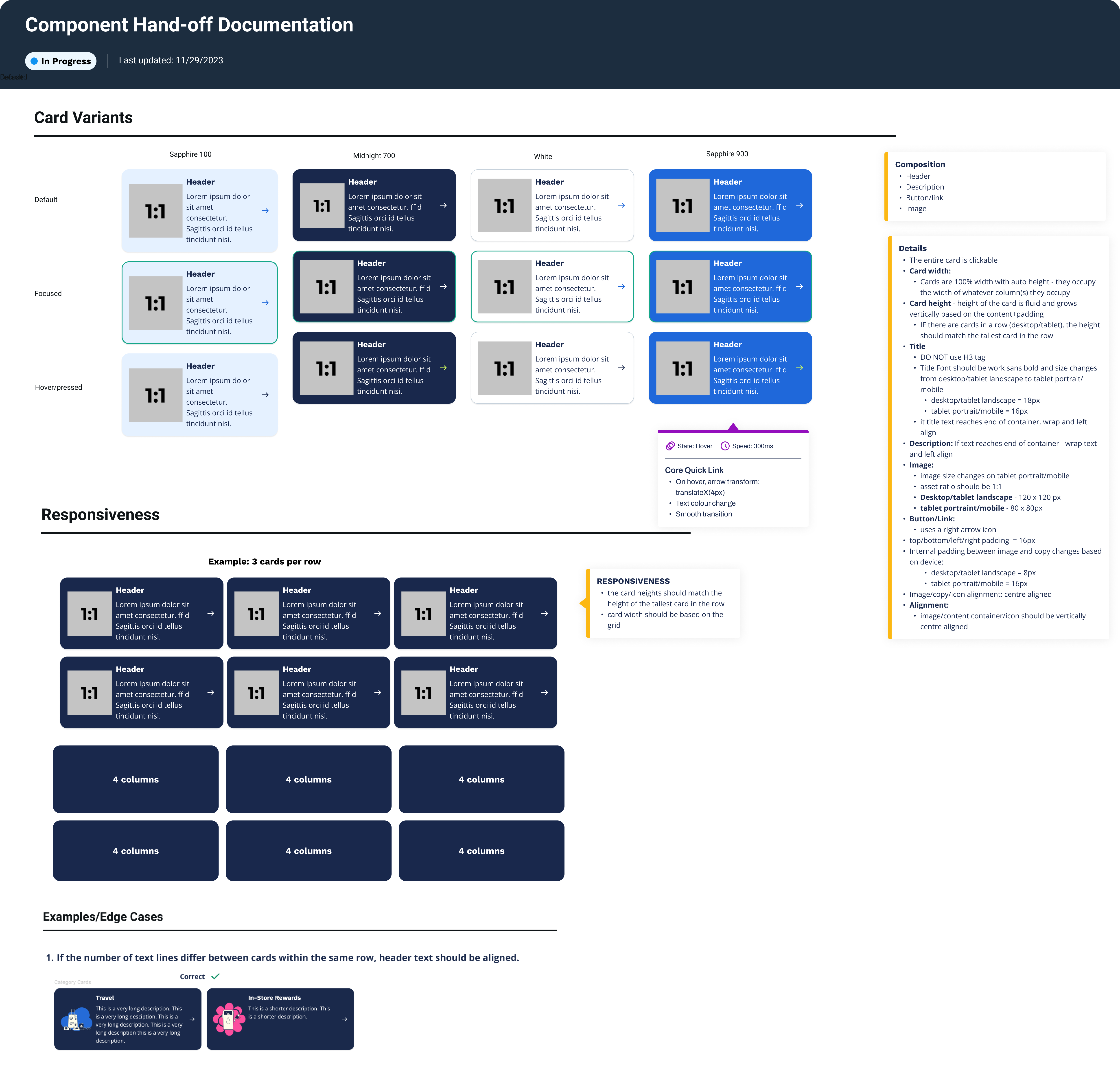
For each component, I created detailed design documentation including specifications, interaction states, and accessibility requirements. I worked closely with developers through implementation to ensure quality and accuracy.
The experience lanuched on January 26, 2026 so we'll be monitoring analytics to measure the impact of the page. I am also working with the Data Science team on a Rewards Recommendation Model which will be used to show a personalized product carousel to collectors at the top of the landing page.