Unlocking 25% More Conversions with In-App eVoucher Redemptions
The AIR MILES app offered limited eVoucher browsing and no way to complete a redemption. Beyond the eVoucher listing screen, collectors were redirected to the AIR MILES website to view eVoucher details and complete a purchase. My product partner and I took a multi-faceted discovery approach to deeply understand the Rewards space, and uncovered three core pain points:
Too many steps and redirects caused drop-off before completing a redemption.
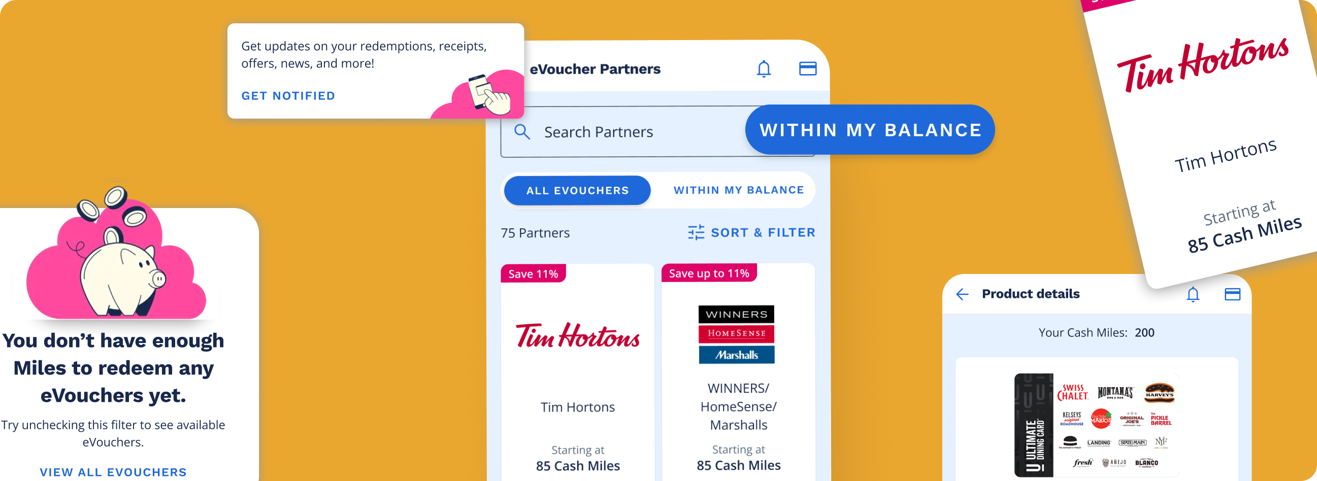
Collectors couldn’t easily find rewards that matched their interests or Miles balance.
Collectors weren’t sure what their Miles were worth or what they could get.
Despite being redirected to the website to complete their redemption, collectors coming from the app made up nearly half of all conversions. These were already engaged collectors. They had downloaded the app, were actively browsing rewards, and were motivated enough to push through the friction of being redirected to web. Giving collectors the ability to browse AND redeem in the app represented a clear opportunity to increase conversion rates.
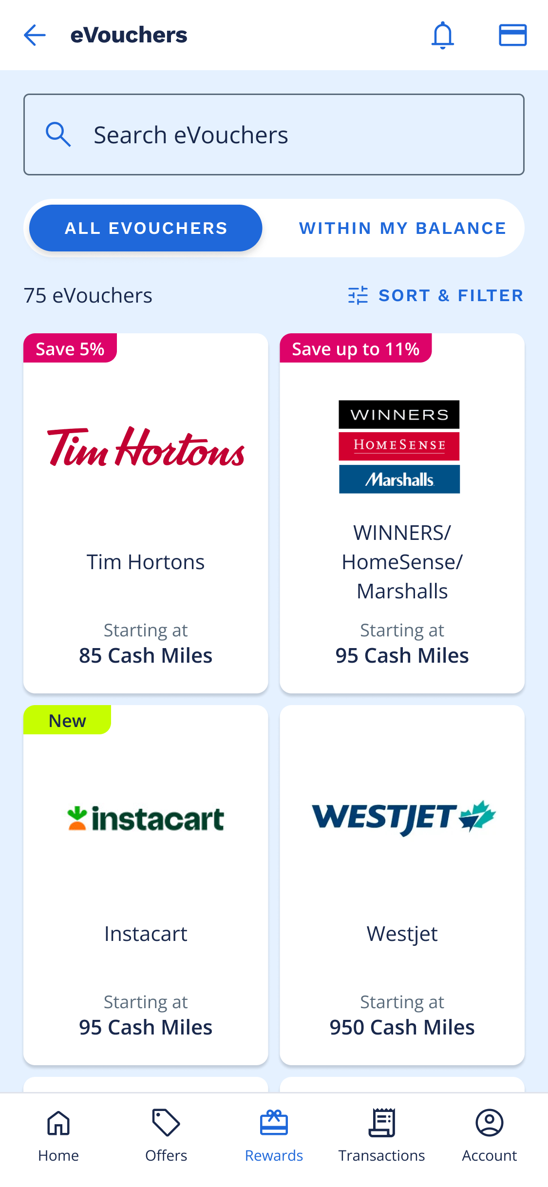
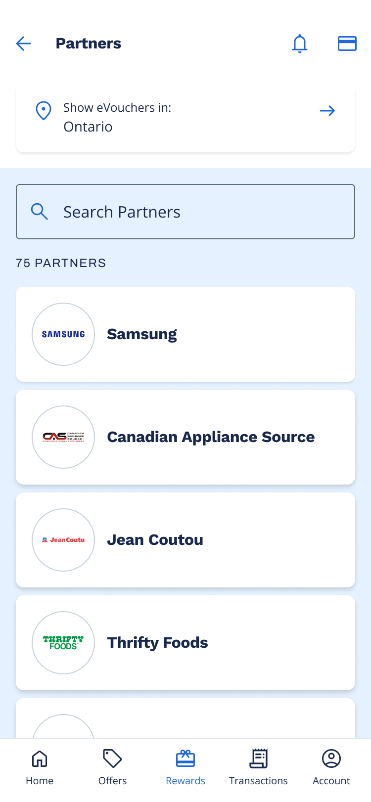
The original product listing page offered limited support for browsing and did not surface critical information that collectors use to support purchase-related decisions such as price or promotions.
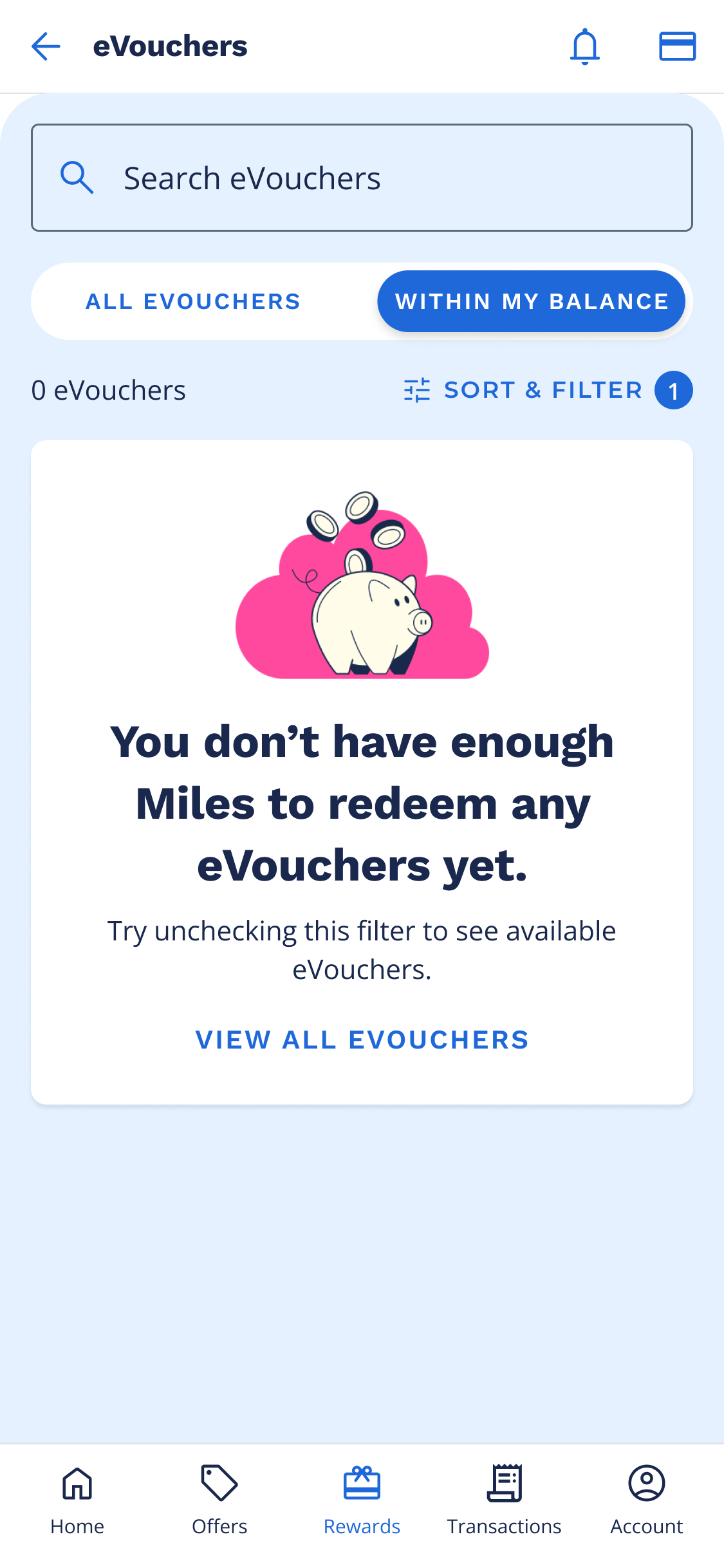
To improve the browsing experience, I re-designed the eVoucher cards to surface high-value information upfront, including "new" and "promotion" badges and a clear "starting at" Miles amount. Market research showed that ~50% of redemptions are spontaneous, so I introduced a quick filter that instantly surfaced rewards collectors could redeem with their current Miles balance.
My hypothesis was that making this information visible directly on the listing page would reduce friction, decrease drop-off, and ultimately drive more redemptions.
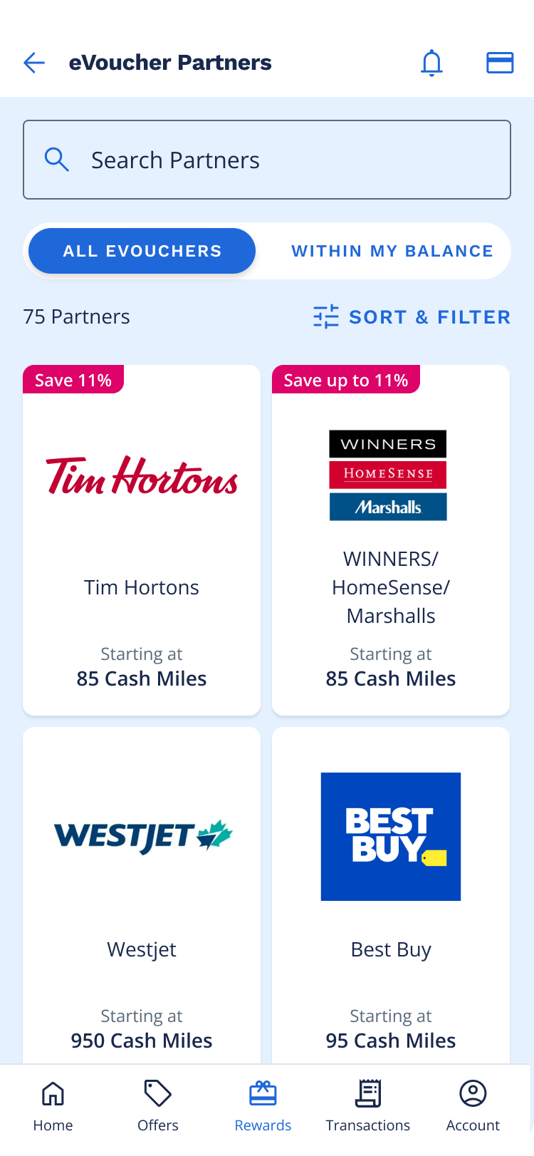
Based on web analytics, the click-through rate for product detail page views was significantly higher when a user filtered on the product listing page. This led to the assumption that adding filters to the PLP in-app would increase click-through rates and ultimately conversions.
I referenced Baymard Institute's UX guidelines for e-commerce filtering to validate which filters to include, how to group them, and how to present default and disabled states for scannability.
I defined filters for Miles range, brand, category, and denomination. Filters are interdependent: selecting an option in one dynamically updates the others to avoid dead ends. Disabled options remain visible with a count of "0", and enabled options are prioritized and sorted alphabetically.
I used AI (Co-pilot) to help flush out edge cases including empty states and dynamic filter logic. This accelerated the design process and helped me catch scenarios I might have otherwise missed.
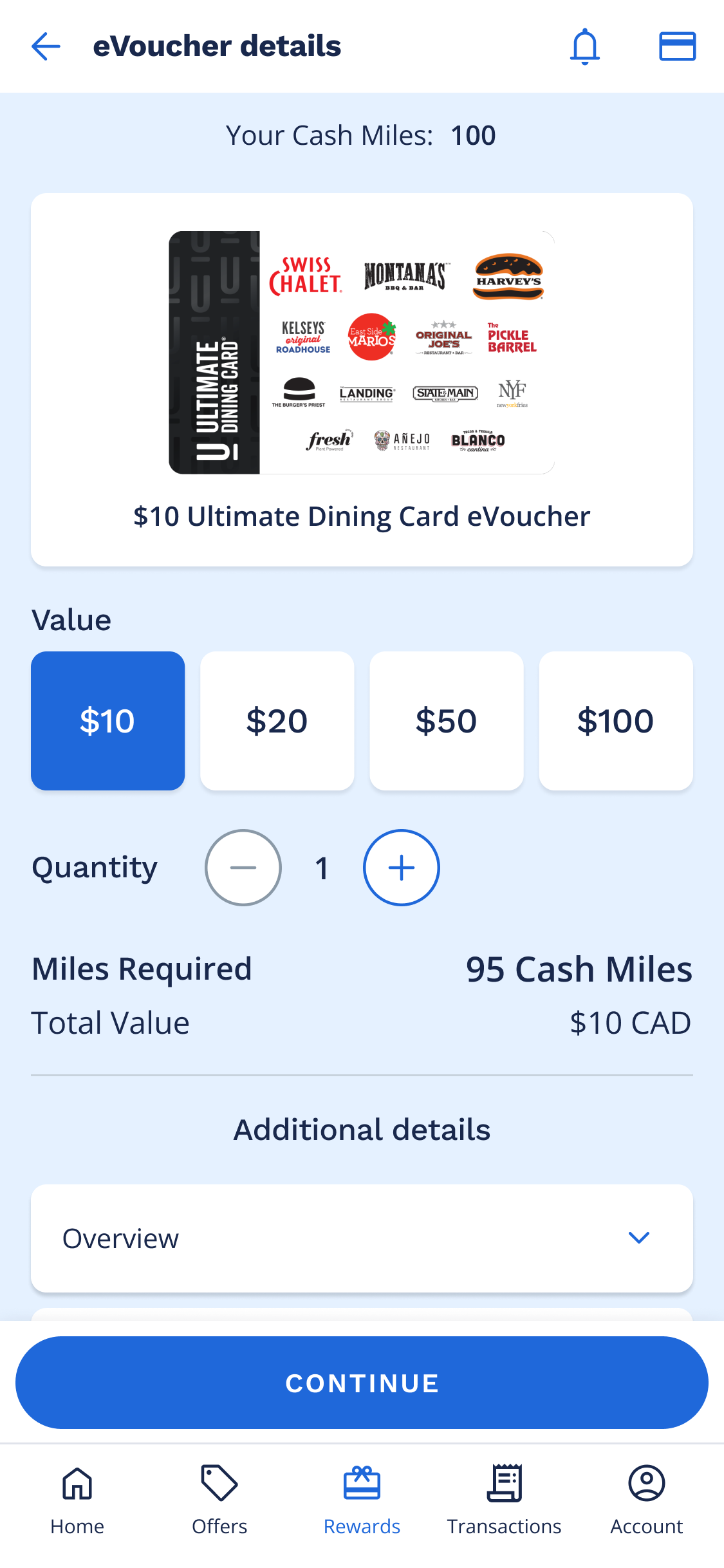
The eVoucher product details page didn't exist in the app. To view the product details, collectors were redirected to web. Existing designs for the product details page were legacy designs from years ago and an initial redesign of the screen had been completed a few months prior. I iterated on this version - refining the layout, simplifying the UI, and focusing on the content hierarchy and what information was most critical to the collector at this point in the browsing flow.
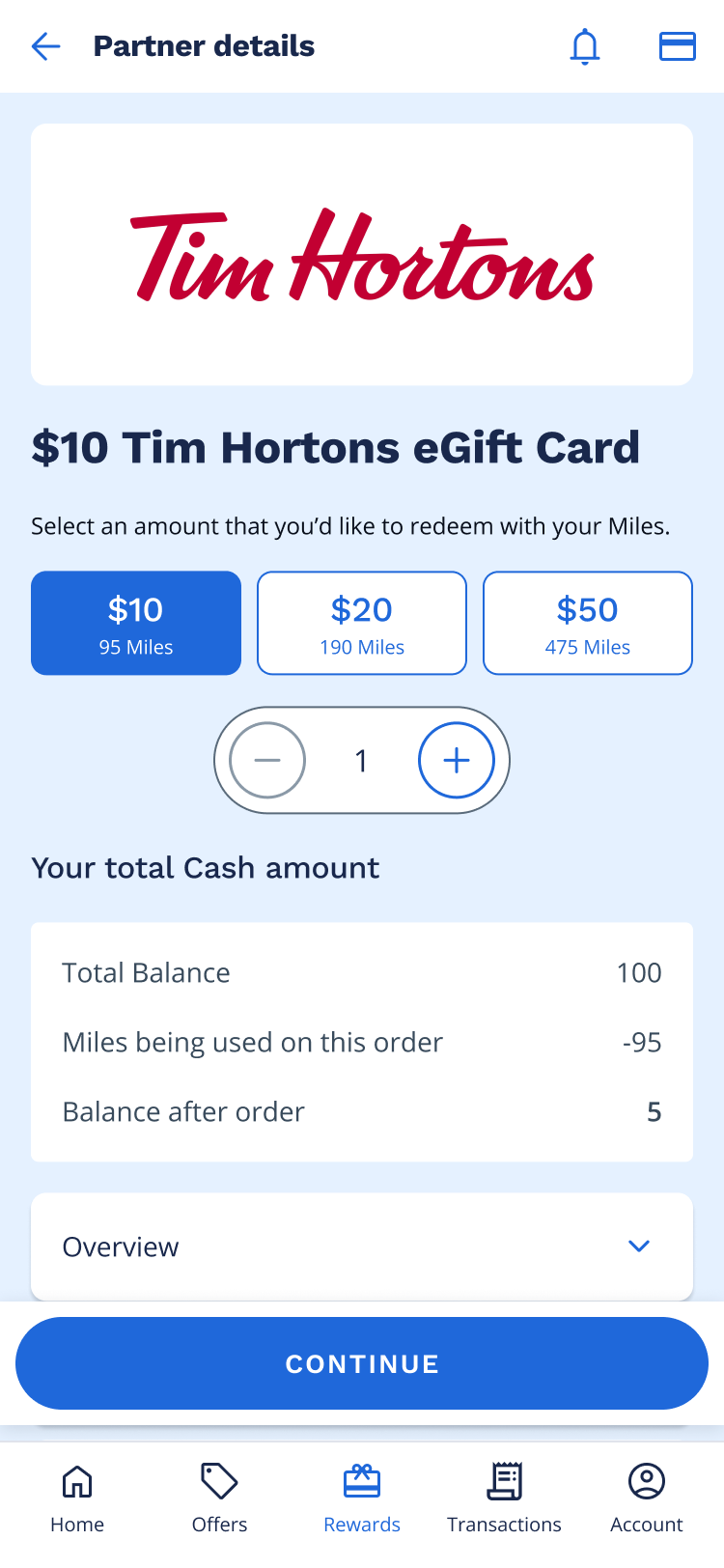
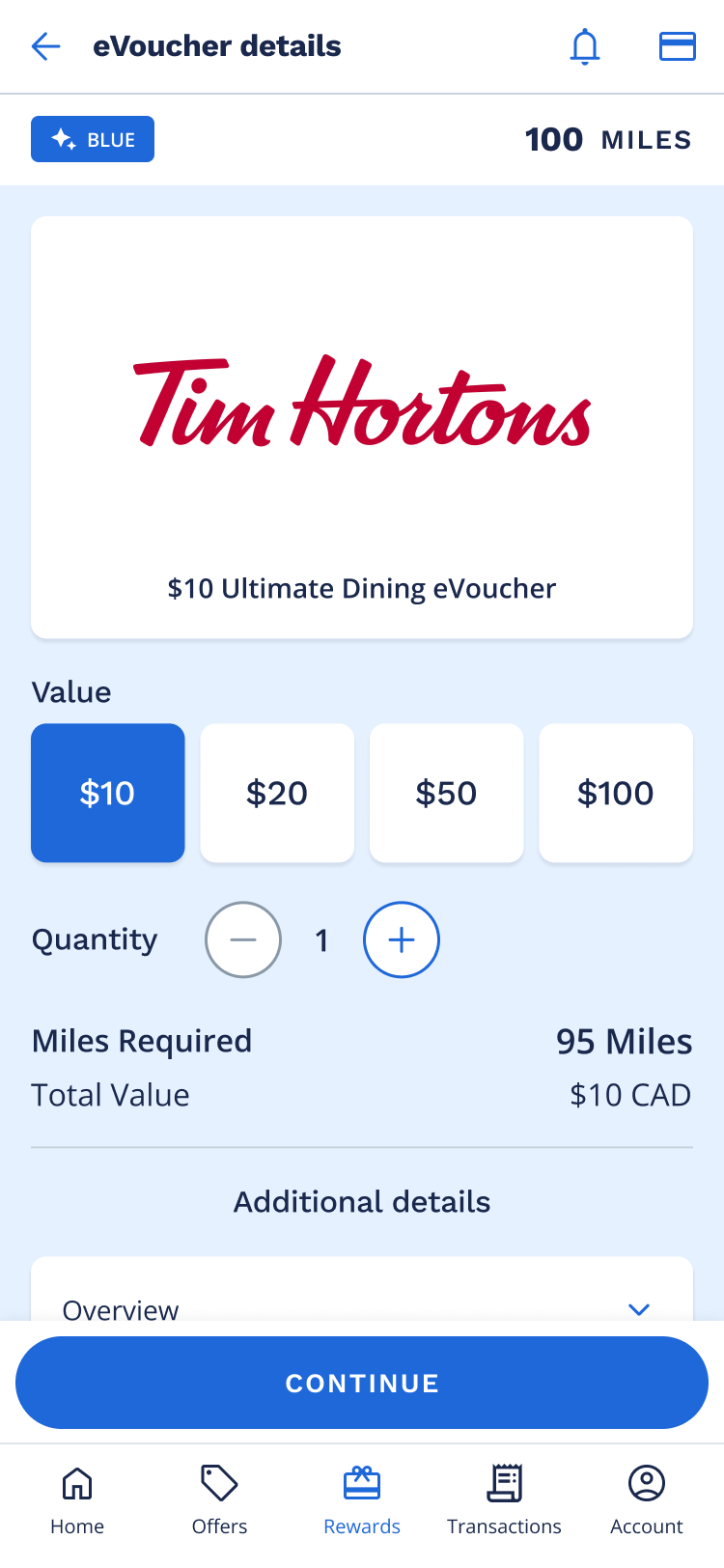
Working within established brand guidelines, I designed 10+ net-new components that gave the in-app experience a cleaner, more polished feel. I handed off detailed documentation covering states and behaviour, and partnered closely with developers through build and implementation.
The filter and sort functionality had a ton of logic that needed to be communicated to developers. I created detailed hand off documentation that captured default states, interaction logic between search, sort and filter (including edge cases), and dynamic behaviour and interdependencies between the filters themselves. This served as a single source of truth and ensured alignment between product, engineering, and design.
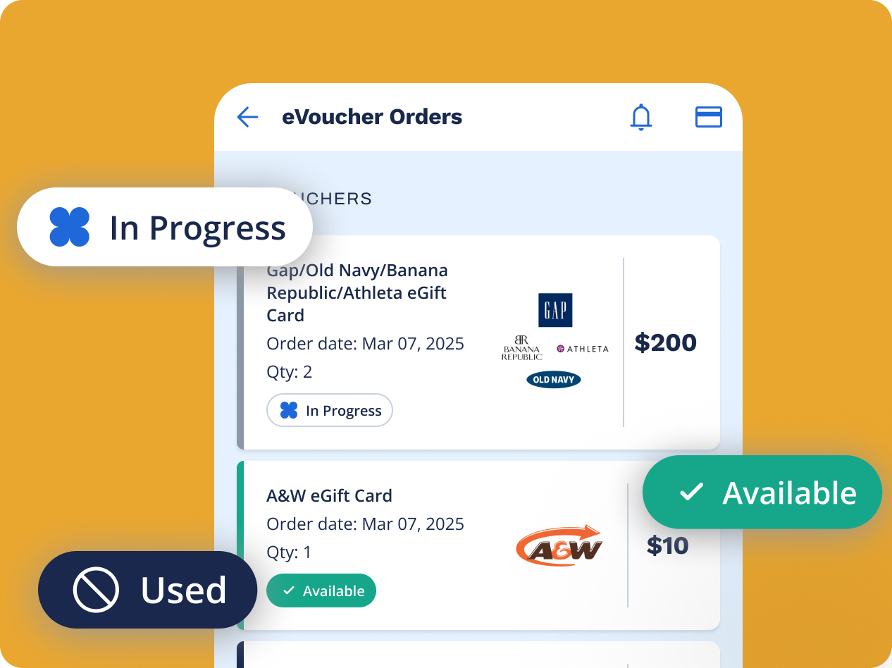
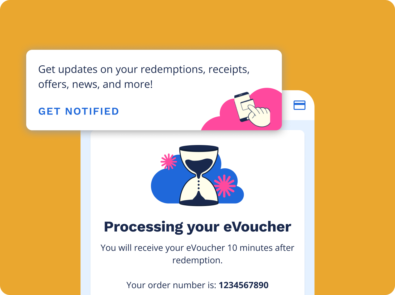
As a future enhancement, we focused on the post redemption experience for collectors. We designed an order history page where collectors can track the status of their evouchers. We also plan to implement notifications to notify collectors when their evoucher is ready to use.