From 2 Steps to 1: Reducing Friction at Checkout
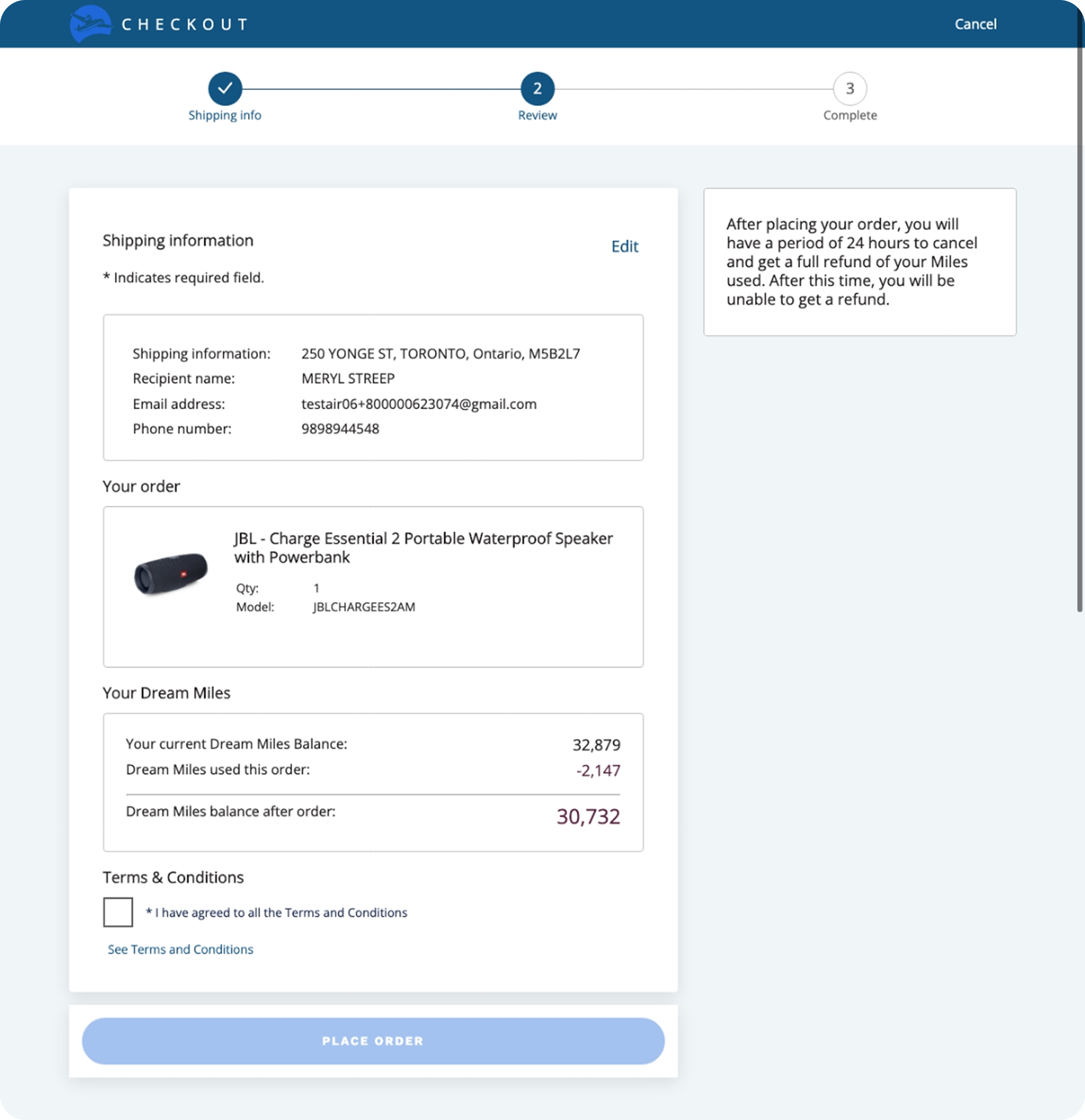
The existing rewards checkout flow on web is a two-step, legacy design that has not been revisited in years. As e-commerce standards have evolved, collectors now expect fast, streamlined purchasing experiences. According to Baymard research, 18% of cart abandonments during checkout are caused by checkout being too long or complicated. Our multi-step redemption process introduces friction at a critical moment in the redemption journey.
Source: Baymard Institute
Our team wanted to validate an ideal-state checkout direction before any engineering investment. Reviewing the existing flow, the IA was unclear and content across the two steps felt redundant. Consolidating into a single step made sense. But unlike traditional e-commerce, our redemption flow has no cart, collector info auto-fills, and Miles cover the full cost so there’s no payment step. The only required input would be a Terms & Conditions checkbox.
This raised a concern: could the experience be too frictionless, risking unintentional purchases? I decided to design the one-step concept, prototype it quickly, and put it in front of collectors for feedback.
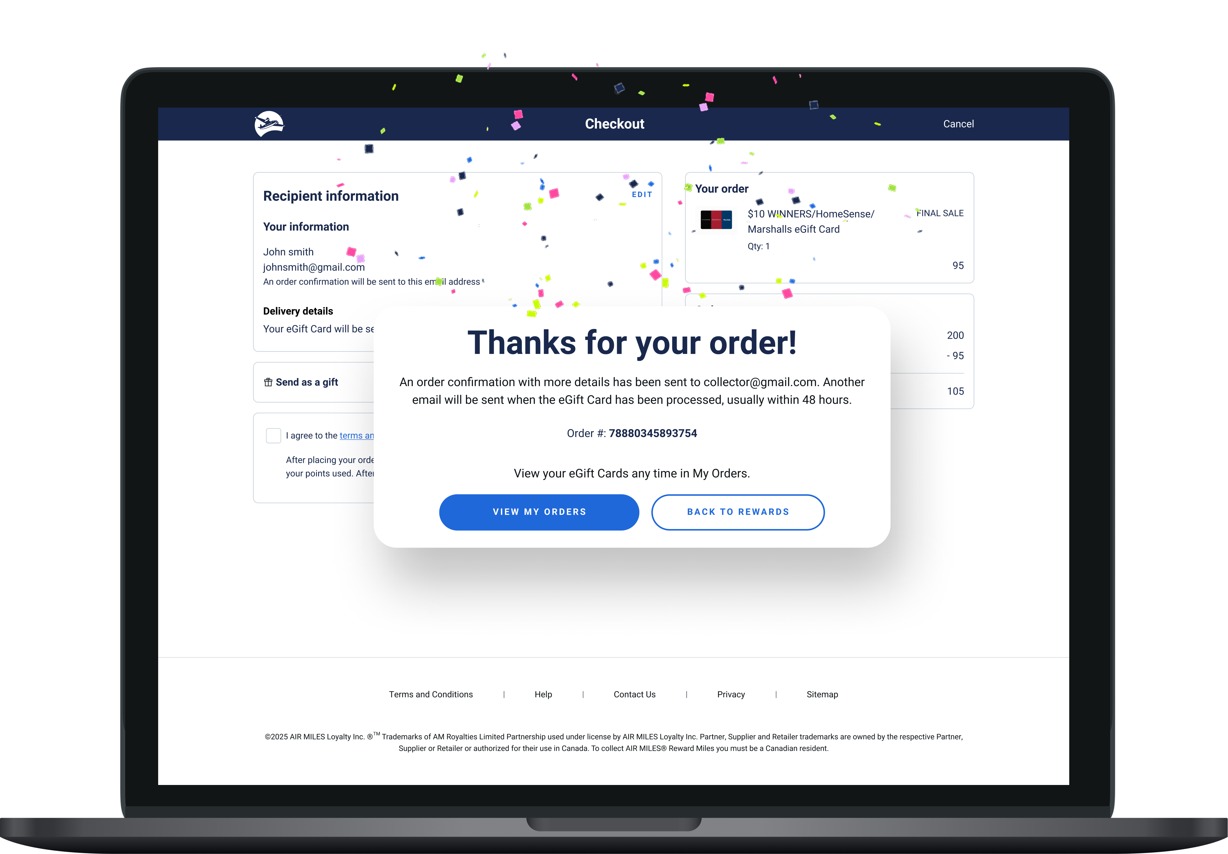
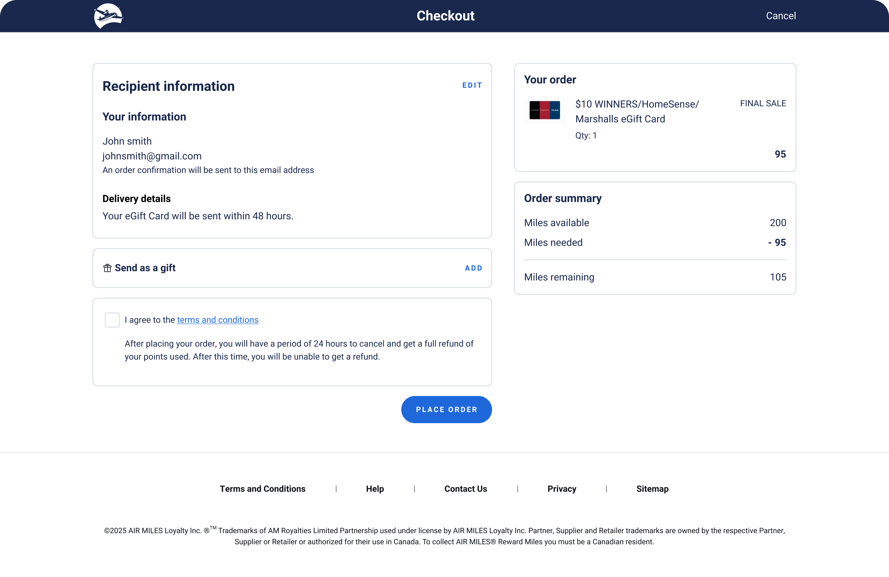
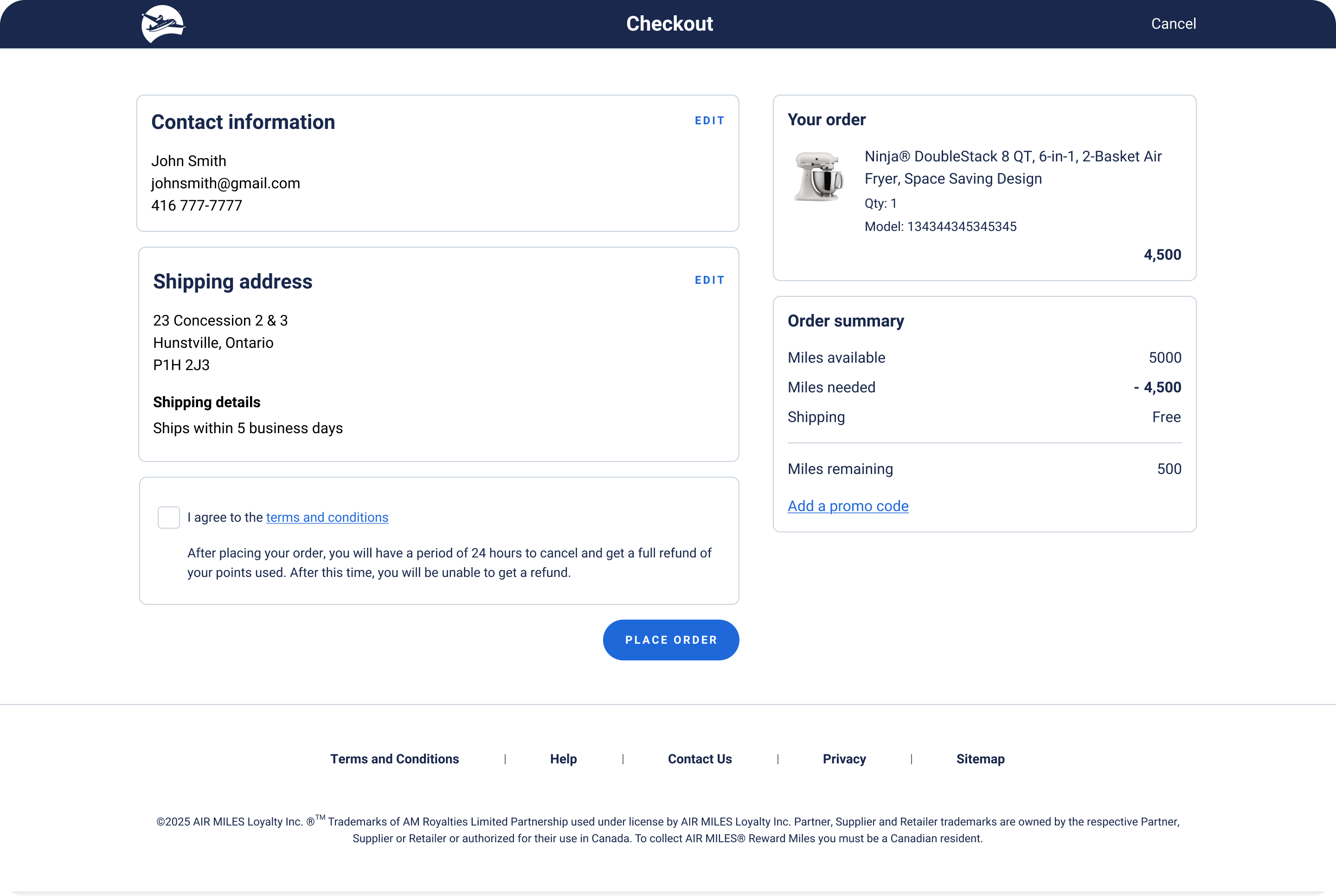
I re-designed checkout from a two-step legacy flow to a one-step unified experience. The goal wasn't simply to remove steps - the two original screens had significant content overlap and an unclear information hierarchy. By consolidating redundant elements, prioritizing key information, and restructuring the layout around a clear visual hierarchy, I reduced cognitive load while making the experience flexible enough to accommodate different reward types.
To reduce risks quickly, I moved from design concept to a prototyped experience quickly using Figma Make. I wanted to validate the one-page concept early, before spending too much time perfecting the UI and align on an ideal-future state direction.
A key concern with simplifying checkout was ensuring the experience didn't feel too frictionless. It was important that participants could interact with the prototoype as realistically as possible including actually filling out and interacting with form fields, waiting for a one-time verification code, and authenticating. These are steps that naturally introduce friction in real checkout flows. Traditional Figma prototyping has limitations when it comes to simulating these behaviours.
Building the prototype in Figma Make
Prototype Walkthrough (0:46)
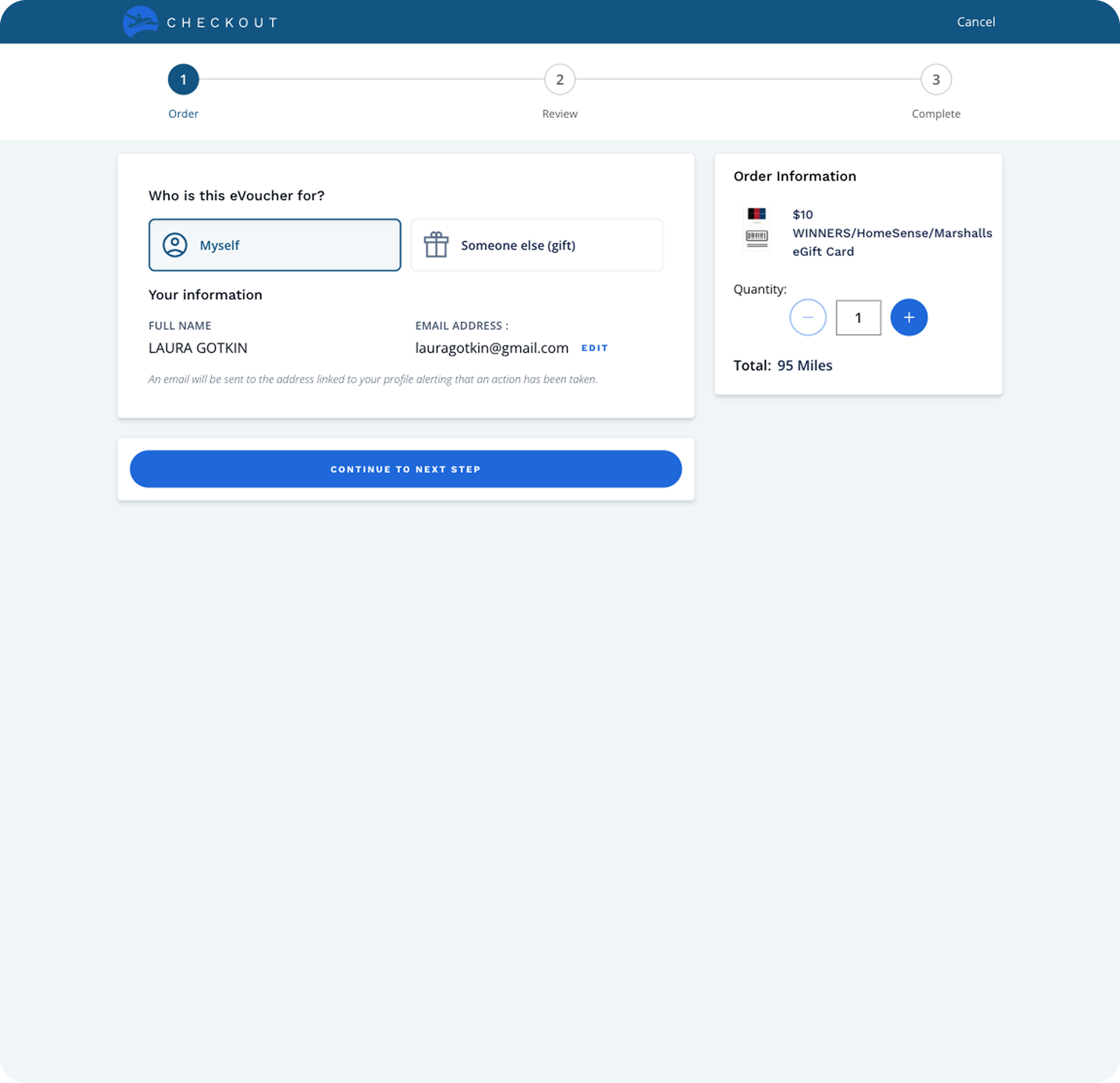
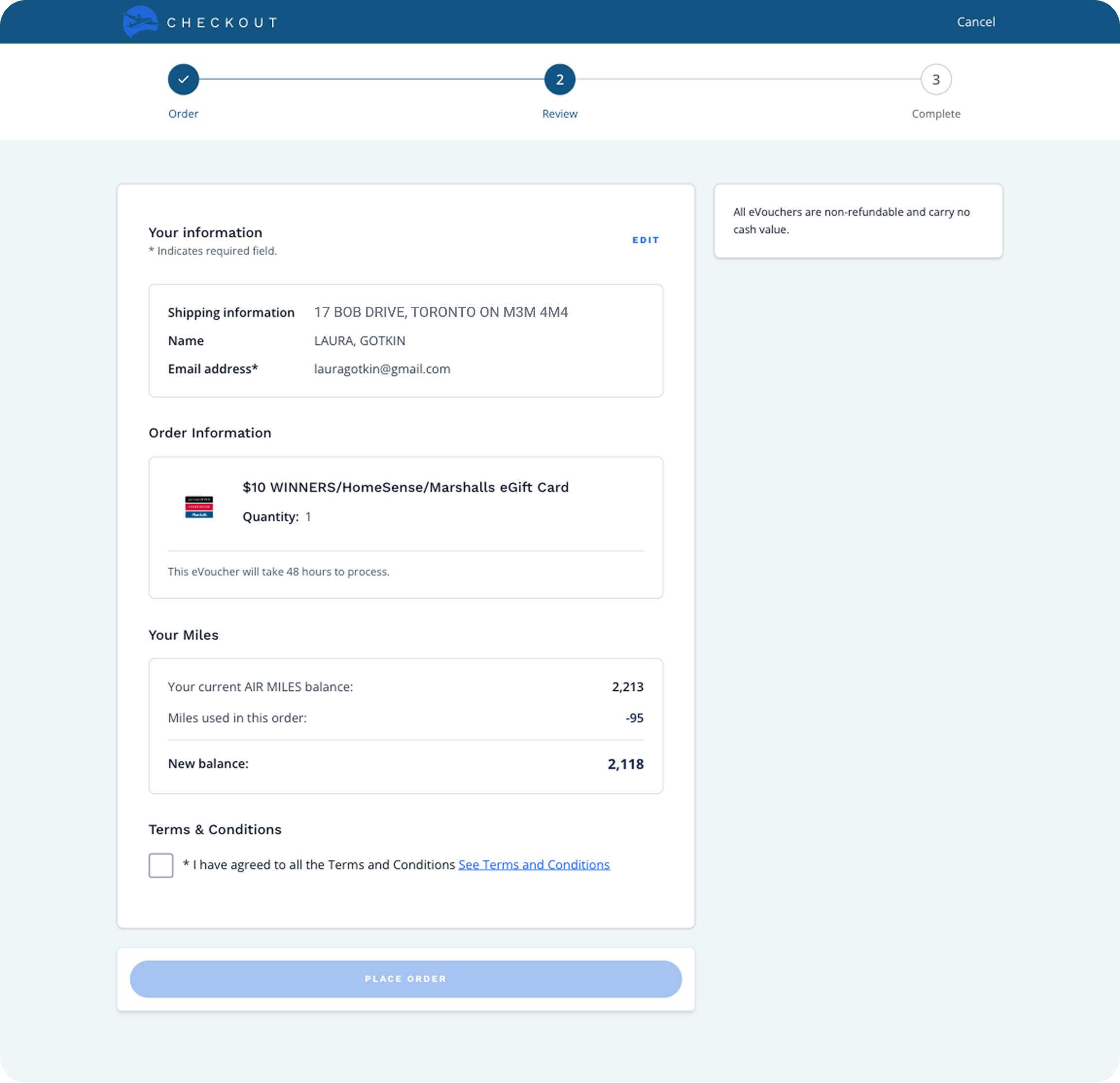
This interactive prototype was created in Figma Make to support real form inputs and conditional logic across checkout scenarios, including gifting, email updates, and denomination selection.
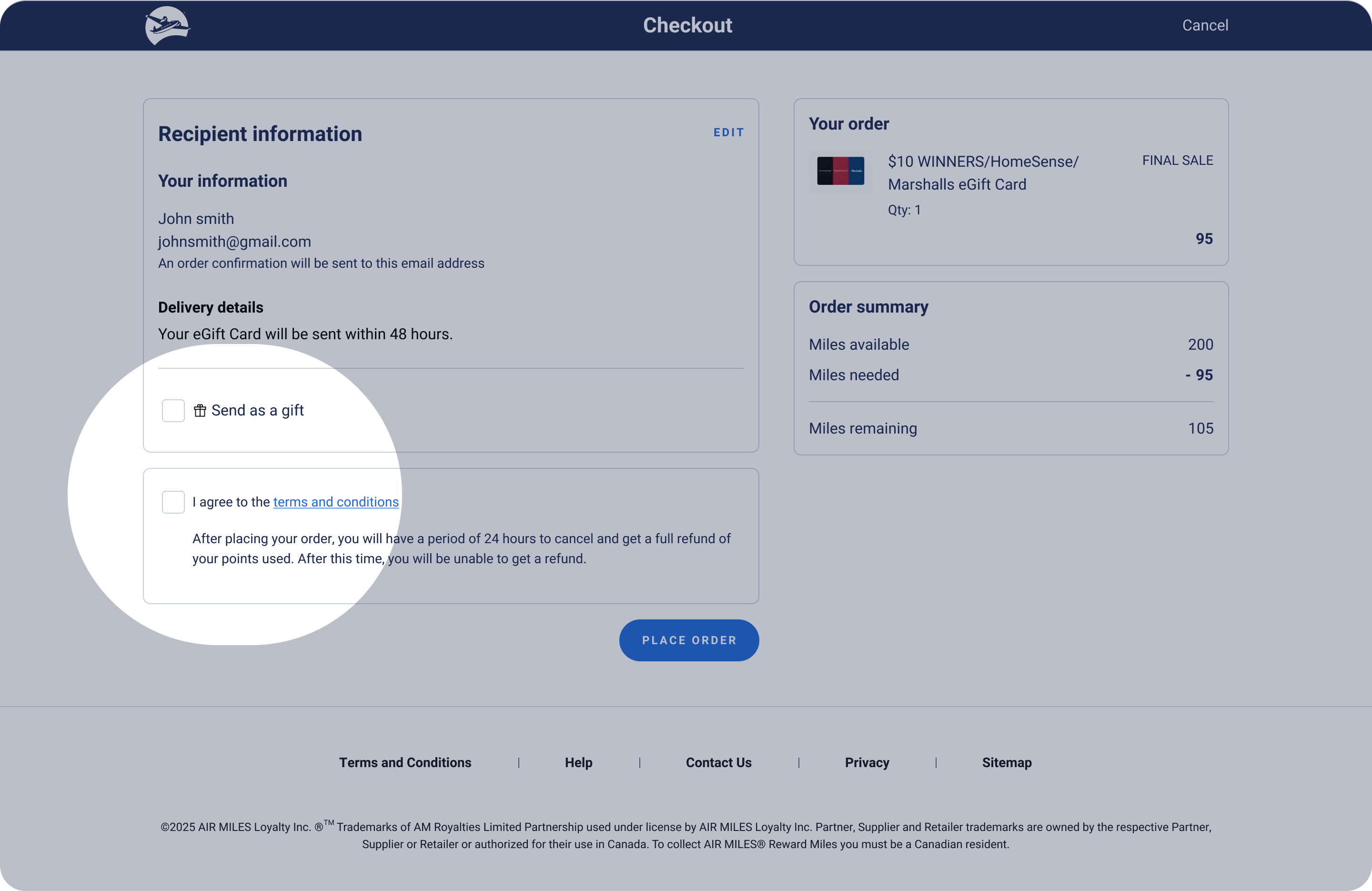
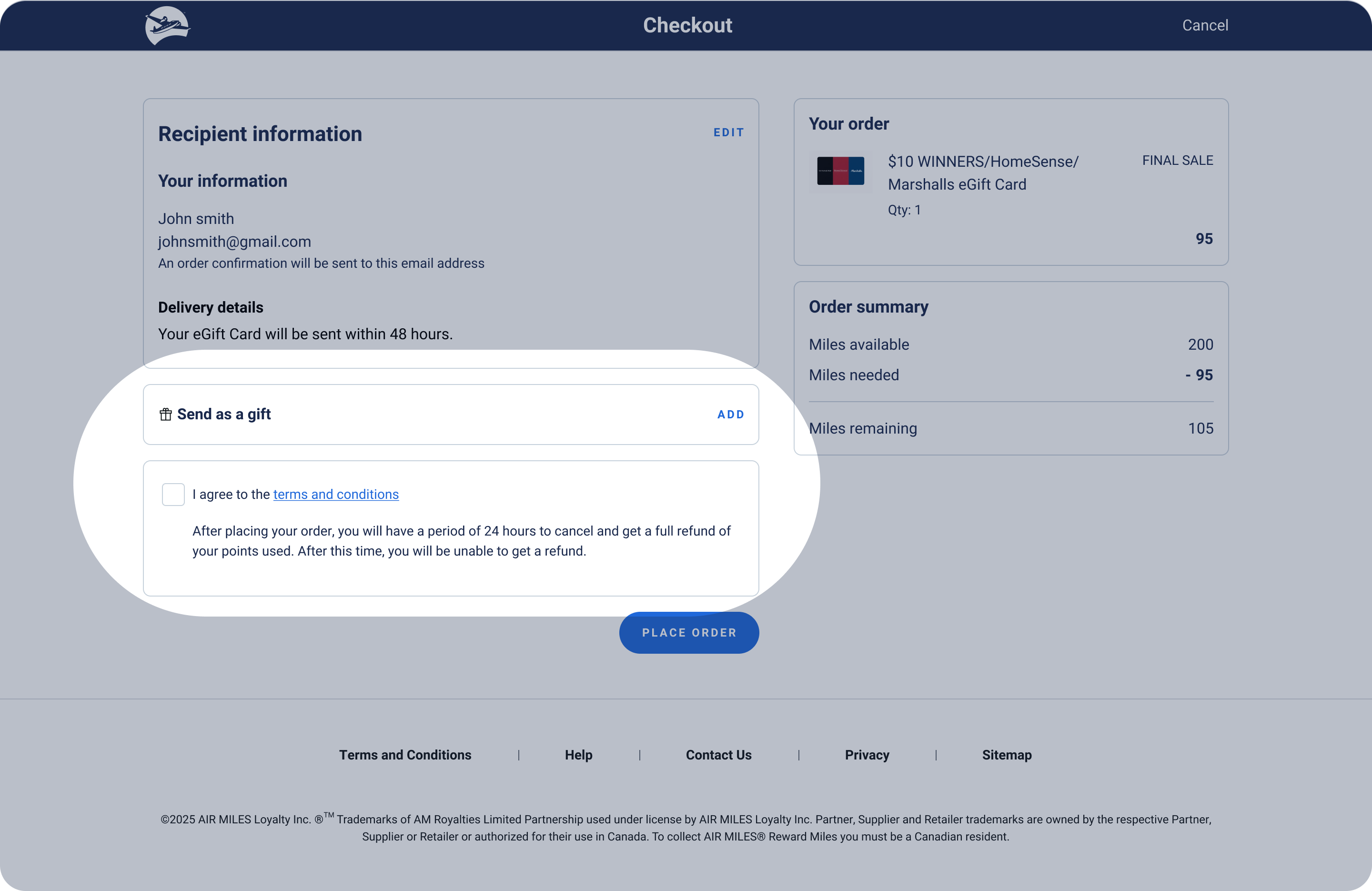
Before formal usability testing, in order to identify my own blind spots and additional areas of friction, I ran a feedback session with internal associates and asked them to walkthrough the prototype. One key insight surfaced: Associates thought that the "Send as a gift" checkbox — which reveals additional form fields for recipient name and email — was a mandatory field due to its placement directly above the Terms & Conditions checkbox. To reduce this friction, I replaced the checkbox with an accordion pattern to visually differentiate it from the Terms and Conditions.
Usability testing validated the core concept: 5 out of 6 users felt there was the right amount of friction throughout the checkout flow, and users who explored the "send as a gift" functionality understood the section and completed it without confusion.
However, the tests surfaced a few other areas of friction. 3 out of 6 users expected to be able to edit quantity directly within checkout rather than navigating back to the product page. Users were also confused by the "edit email" functionality, with 2 collectors expecting a verification step when changing the delivery email as they wanted protection against unauthorized changes.

Because the prototype was built with functional code rather than a Figma click-through, participants could type into form fields, make their own selections, and move through checkout flow as they naturally would. Dynamic fields and conditional logic responded to their inputs in real time. Using a realistic prototype surfaced sharper, more specific usability insights that a static prototype would have likely missed.
As the first designer on the team to use AI-built prototypes for usability testing, this project demonstrated the value of the approach and set a precedent for how the team could test and learn faster going forward.